When Worthing Borough Council began developing a new wayfinding initiative for the town, they turned to Sight Support Worthing for expert guidance. The result is signage and navigation designed not just for the many, but for everyone, including the one in five people in the UK who live with some form of sight loss.
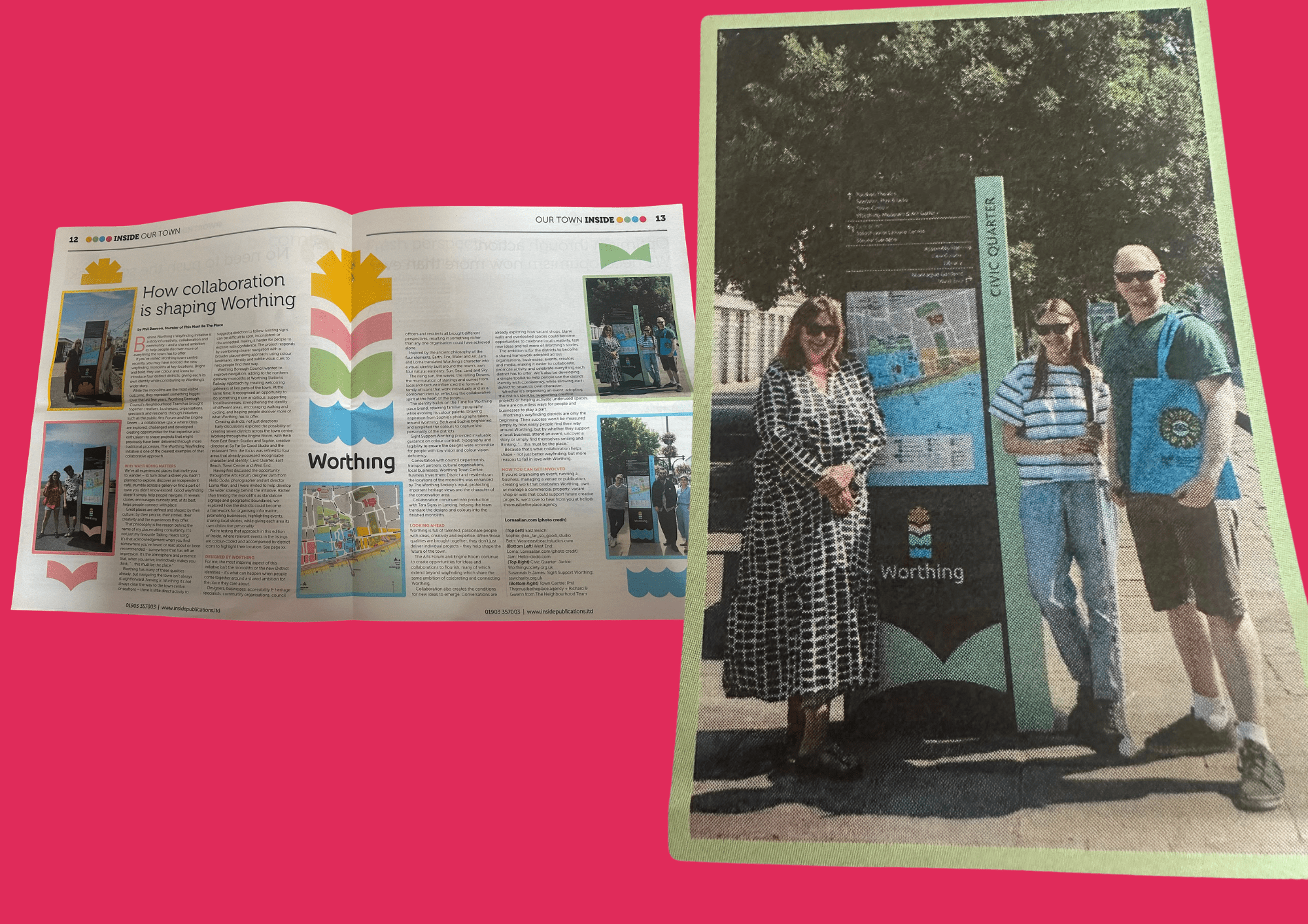
The project featured in the August 2026 edition of Inside Worthing magazine, with SSW’s James sharing his expertise on what truly accessible wayfinding looks like in practice.
It started with a question about colour
The conversation began when someone at the council raised a question about the blue tones being used in the signage design, specifically, whether the shade chosen would allow text to remain legible for someone with low vision. It’s the kind of detail that’s easy to overlook, but makes an enormous difference to people navigating the town every day.
In accessibility terms, contrast refers to how well one colour stands out against another. The tool our team recommended — WebAIM’s free contrast checker — allows designers to upload their text and background colours and receive an instant accessibility score. It’s simple, free and invaluable.
One important nuance the team highlighted: contrast behaves differently on screen than on print. A digital display emits light, while a printed sign reflects it, meaning a colour combination that passes on a website may not work as well on a physical board in varying light conditions. Both need to be considered separately.
The details that make the difference
Beyond colour, the SSW team shared a range of practical principles that informed the project which was managed and created by Phil Dawson, founder of This Must Be the Place:
- Bold text can help important information stand out, but there’s a trade-off. The thicker strokes of bold type reduce the definition between letters; to someone with low vision, a capital B and a capital D can become almost indistinguishable.
- Elaborate fonts and decorative text effects such as drop shadows create similar problems, introducing visual noise that makes words harder to parse.
- Text alignment matters too. Left-aligned text means every line in a body of copy begins at the same point, which is particularly helpful for people using magnifiers. It allows a reader to follow a line to its end, then return cleanly to the start of the next, without losing their place.
- Even spacing between words supports the same principle, providing the visual consistency that makes reading easier.
Why this matters
Wayfinding is about confidence. For someone with sight loss, signage that is clear, well-contrasted and consistently laid out can mean the difference between navigating a town centre independently or not at all. SSW was proud to contribute to a project that puts accessibility at the heart of how Worthing presents itself to residents and visitors alike.
If you’d like to know more about SSW’s work in the community, or to find out how we can support your organisation with accessibility guidance, please get in touch.